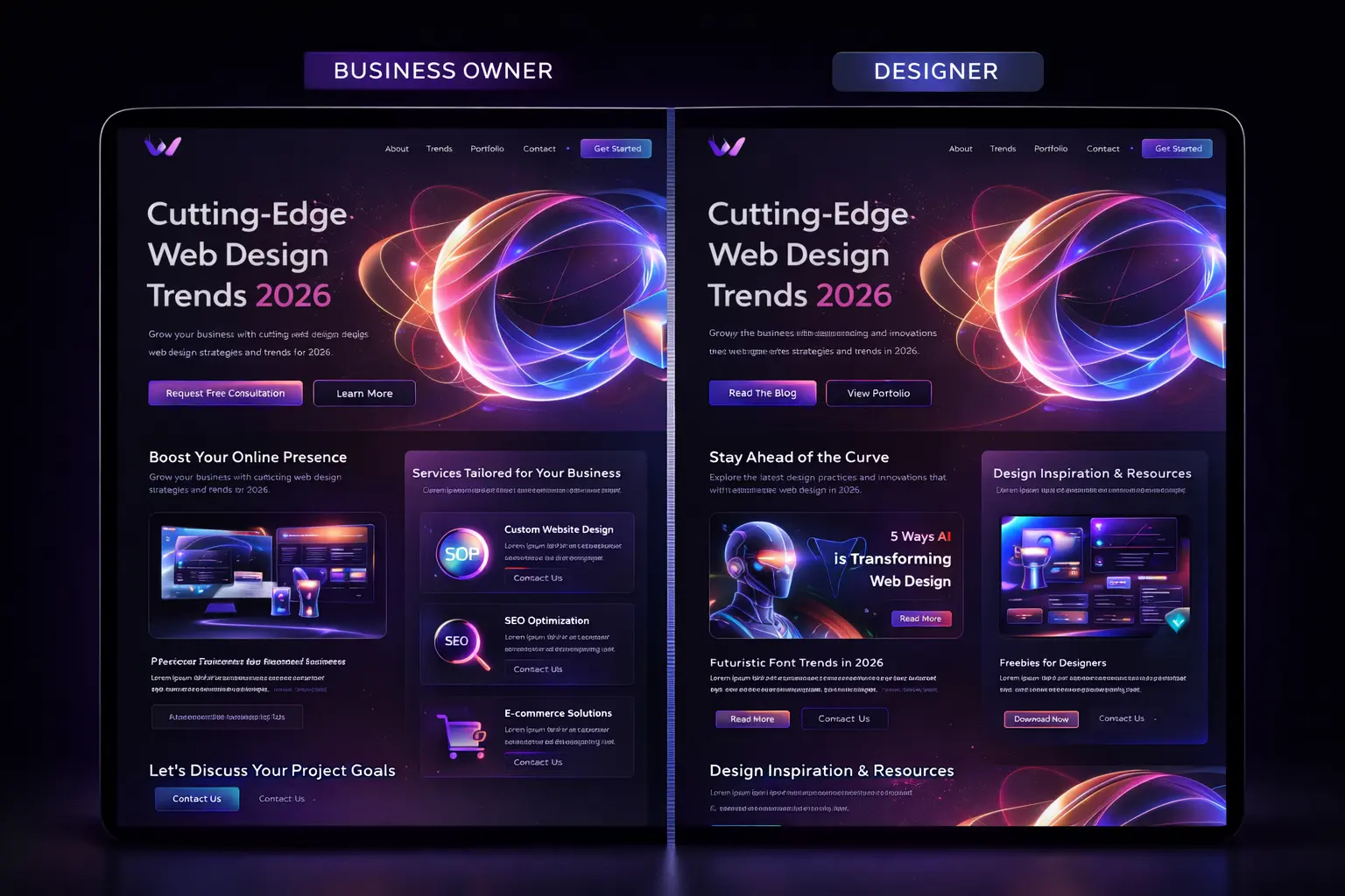
The web design landscape in 2026 has shifted in ways that would have seemed unlikely just a few years ago. AI-assisted design tools have democratized visual creation, spatial computing has introduced entirely new interaction paradigms, and performance has become inseparable from aesthetics. The websites winning awards and converting visitors are those that embrace these shifts while maintaining the timeless principles of clarity, usability, and purpose.
Whether you are planning a website redesign or building something new from scratch, understanding these trends will help you create digital experiences that feel current, perform excellently, and genuinely serve your users.
AI-Assisted Design: The New Creative Partner
AI has not replaced designers, but it has fundamentally changed their workflow. In 2026, the most productive design teams use AI tools for rapid prototyping, variation generation, and design system management while reserving human judgment for strategic decisions, brand alignment, and emotional resonance.
Tools like Figma AI, Framer's generative features, and Adobe Firefly can now produce layout variations, generate responsive breakpoints, and suggest accessibility improvements in real time. This means designers spend less time on repetitive production work and more time on the creative and strategic decisions that actually differentiate a brand.
The practical impact for businesses is significant. Design iteration that once took weeks can now happen in days. A/B testing visual approaches is faster and cheaper. And AI-generated design suggestions often surface creative directions that human designers might not have considered, leading to more innovative outcomes.
However, the sites that look most generic in 2026 are those that rely entirely on AI-generated designs without human creative direction. AI is a tool, not a taste. The best results come from designers who use AI to accelerate execution while maintaining a strong, opinionated creative vision. This is the approach our custom website development team takes, using AI to enhance productivity while ensuring every project has a distinctive identity.
Performance-First Design: Speed as Aesthetic
Performance Impact on Conversion Rates
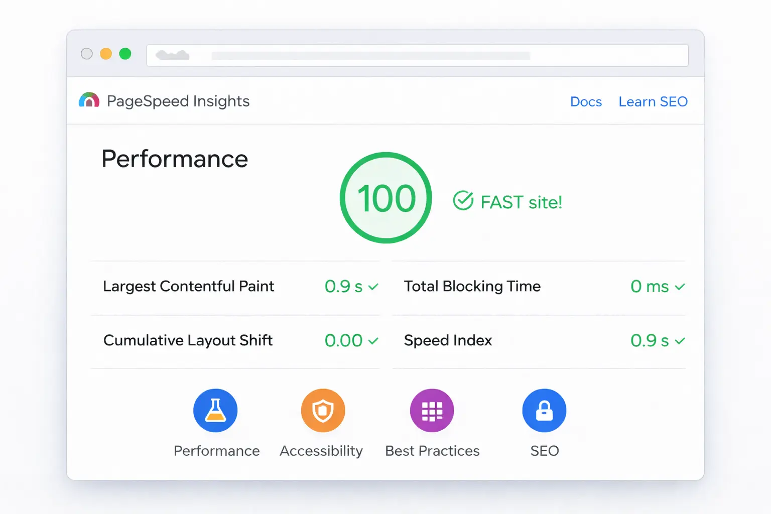
The most significant philosophical shift in web design is the understanding that performance is not a technical constraint to work around but a design principle to embrace. Sites that load instantly feel more premium, more trustworthy, and more enjoyable than visually impressive sites that keep users waiting.
This has led to a design movement some call "performance-first aesthetics", where visual decisions are made with loading speed as a primary consideration. Designers are choosing system font stacks over custom web fonts, using CSS-native effects (gradients, blend modes, masks) instead of heavy image assets, and leveraging modern image formats like AVIF that deliver better visual quality at smaller file sizes.
Core Web Vitals are now a confirmed ranking factor, and designers have learned that a beautiful site that scores poorly on LCP, INP, and CLS is a site that will not rank, will not convert, and will frustrate users. The best design systems in 2026 include performance budgets as a design constraint alongside brand guidelines.
Practically, this means using progressive enhancement rather than graceful degradation. Start with a fast, functional experience, then layer in enhancements for capable devices and fast connections. Use the `content-visibility` CSS property to defer rendering of off-screen content. Implement view transitions for smooth page navigations without the overhead of a full SPA framework.
Spatial Design and 3D Elements
With Apple Vision Pro reaching mainstream adoption and WebXR maturing as a platform, spatial design has moved from experimental to practical. This does not mean every website needs to be a 3D environment, but designers are increasingly incorporating spatial elements that add depth and interactivity.
3D product viewers have become standard for e-commerce, with WebGL and Three.js enabling interactive product exploration that rivals in-store experiences. Customers can rotate, zoom, and examine products in detail, which has been shown to reduce return rates by up to 35%.
Parallax depth effects using CSS `scroll-timeline` and the new `animation-timeline` property create a sense of spatial layering without the performance overhead of JavaScript-driven parallax. These effects add visual richness while maintaining excellent Core Web Vitals scores.
Glassmorphism and layered transparency have evolved into more sophisticated spatial compositions. Modern CSS `backdrop-filter` support across all major browsers means designers can create depth through translucency, blur, and layering without heavy image assets or complex workarounds.
The key principle is purposeful depth. Every 3D element or spatial effect should serve the user experience, whether that is helping customers understand a product, creating visual hierarchy, or guiding attention through a page.
Micro-Interactions and Motion Design
Motion design has matured from a decorative afterthought to a fundamental component of user experience. In 2026, the most effective micro-interactions serve three purposes: they communicate state changes, they guide user attention, and they create emotional resonance.
The View Transitions API, now widely supported, has made page-to-page transitions seamless without requiring a single-page application architecture. This means multi-page sites built on frameworks like Next.js can deliver app-like transition experiences while maintaining the SEO and performance benefits of server-rendered pages.
Scroll-driven animations using the CSS `animation-timeline: scroll()` property have largely replaced JavaScript scroll libraries. This is significant because scroll animations now run on the compositor thread, delivering smooth 60fps performance without janking the main thread. Designers can create rich, scroll-linked visual narratives that perform consistently across devices.
State-based micro-interactions like hover effects, loading indicators, and form validation feedback have become more sophisticated but also more consistent. Design systems in 2026 typically include a comprehensive motion library with defined easing curves, duration scales, and interaction patterns that maintain consistency across an entire product.
For businesses building web applications, investing in a well-designed motion system pays dividends in perceived performance, user satisfaction, and brand differentiation.
Accessibility as Default
| Accessibility Feature | WCAG Level | Business Impact |
|---|---|---|
| Alt text for images | A | SEO + Inclusivity |
| Keyboard navigation | A | Usability |
| Color contrast (4.5:1) | AA | Readability |
| Focus indicators | AA | Navigation |
| ARIA landmarks | AA | Screen readers |
| Captions for video | AA | Engagement |

The most important trend in 2026 web design is not visual at all: accessibility has become a non-negotiable baseline. The combination of stricter regulations, improved tooling, and genuine ethical commitment means that the best design teams build accessibly from the start rather than retrofitting it later.
The European Accessibility Act enforcement that began in 2025 has made compliance a legal requirement for businesses operating in the EU. This has accelerated adoption globally, as international businesses build to the highest standard rather than maintaining separate accessible and non-accessible versions.
Practically, accessible design in 2026 means: semantic HTML as the foundation (not divs styled to look like buttons), sufficient color contrast (minimum 4.5:1 for normal text), keyboard navigation that works completely without a mouse, screen reader compatibility with proper ARIA labels and live regions, and reduced motion support for users who are sensitive to animation.
The business case is undeniable. Accessible websites perform better in search (because semantic HTML is what search engines prefer), convert better (because more people can use them), and face fewer legal risks. Every site we build at Devimus includes comprehensive accessibility compliance as standard.
Typography and Variable Fonts
| Font Technology | File Size Reduction | Browser Support |
|---|---|---|
| Variable Fonts | Up to 70% smaller | 97%+ |
| WOFF2 Compression | 30% smaller than WOFF | 98%+ |
| Font Subsetting | Up to 90% smaller | Universal |
| System Font Stack | Zero download | Universal |
Typography in 2026 is having a renaissance, largely driven by the maturation of variable fonts and advanced CSS typography features. Designers now have unprecedented control over type rendering, enabling more expressive and performant typography.
Variable fonts allow a single font file to contain an entire family of weights, widths, and styles. This dramatically reduces file sizes (one variable font file replaces 10+ static font files) while giving designers infinite granular control. The `font-variation-settings` CSS property enables real-time typography adjustments that respond to screen size, scroll position, or user interaction.
Fluid typography using CSS `clamp()` has replaced rigid breakpoint-based font sizing. A declaration like `font-size: clamp(1rem, 2.5vw, 1.5rem)` creates typography that scales smoothly across every screen size without a single media query. Combined with the CSS `text-wrap: balance` property for headings, text looks polished at every viewport width.
Large, expressive display typography continues to dominate hero sections and landing pages. The trend is toward bold, oversized headings that create immediate visual impact, often combined with subtle motion effects. But the best implementations maintain readability and do not sacrifice page speed for typographic drama.
Dark Mode and Adaptive Theming
Dark mode has evolved from a trend into an expectation. In 2026, adaptive theming goes beyond simple light/dark toggles to create experiences that respond to time of day, ambient lighting, user preference, and even content type.
The CSS `prefers-color-scheme` media query remains the foundation, but modern implementations add manual override toggles, time-based automatic switching, and per-section theming where different parts of a page can use different color modes based on content needs.
Design tokens managed through systems like Style Dictionary or Figma Variables ensure that theme switching is consistent and maintainable. Rather than duplicating color values, designers define semantic tokens (like `color-surface-primary` and `color-text-secondary`) that map to different values in each theme.
For landing pages and marketing sites, dark themes often convey sophistication and premium positioning. For content-heavy sites like blogs and documentation, light themes typically offer better readability for extended reading. The best approach is offering both and letting users choose.
Sustainable Web Design
A growing movement in 2026 focuses on the environmental impact of web design. The internet accounts for approximately 3.7% of global carbon emissions, roughly equivalent to the airline industry. Sustainable web design aims to reduce this footprint through smarter design and development choices.
Practically, sustainable design aligns perfectly with performance-first design. Smaller page weights mean less energy consumed by data centers and devices. Efficient code means less processing power required. Optimized images mean less data transferred. A site that loads in 1 second instead of 5 consumes dramatically less energy per page view, and when multiplied across millions of visits, the impact is significant.
Design decisions that support sustainability include: using system fonts when custom fonts are not essential, implementing dark modes (which use less energy on OLED screens), lazy loading off-screen content, and choosing static generation over server-side rendering where possible. The Website Carbon Calculator can estimate your site's environmental impact per page view.
Getting Your Design Right
The common thread through every 2026 design trend is purposefulness. The best websites are not those that incorporate every trend but those that select the approaches that serve their specific audience, goals, and brand identity.
Before making design decisions, start with questions: Who is your audience? What action do you want them to take? What emotional response supports that action? What technical constraints exist? The answers to these questions should drive every visual, interactive, and structural choice.
If your current website feels outdated, underperforms on mobile, or does not convert visitors effectively, our website redesign services can help you create a modern, high-performing digital presence. Contact us for a free estimate and we will assess your current site and recommend the most impactful improvements.