


A product page converts when it removes the uncertainty that stops a purchase. When shoppers hesitate, the missing piece is often a practical detail, such as whether the item fits, when it will arrive or what happens if it needs to go back, rather than the price. This product page conversion checklist covers the questions to answer, how to keep variants consistent and how to find where buyers actually drop off, so you fix the right thing first.
Why do shoppers hesitate on product pages?
Most people arrive at a product page with a short list of doubts. Will it fit? Will it work with what I already have? Is the colour accurate? When will it arrive, and what does delivery cost? Can I return it easily? If the page leaves any of those open, the shopper either leaves to check elsewhere or postpones the decision.
The fastest way to find those doubts is to read what customers already tell you. Pre-sale emails, chat logs, reviews and return reasons usually repeat the same few questions, and each one is a gap the page should close. This is the same principle behind fixing a site that gets traffic but no enquiries: find the unanswered question before changing the design. Before a shopper even reaches this page, a well-planned category page should already have narrowed the choice.
How do you answer the fit question?
Provide dimensions, materials, compatibility and intended use wherever they affect the decision. State how measurements were taken when that is not obvious, such as internal versus external dimensions. Explain limitations plainly: if a product is not suitable for outdoor use or for a certain model, say so near the top.
Show real product images from useful angles. Include a scale reference, close-ups of material or finish, and the item in use where that helps. A conceptual campaign image cannot replace evidence of the actual item, especially when size or finish matters. Keep images light enough to load quickly on mobile; our guide to Core Web Vitals and INP explains why slow, heavy pages lose buyers.
How should you write the product description?
Write for the buyer’s decision, not for a keyword count. Lead with the two or three facts that most often decide the purchase, then add supporting detail underneath. Short paragraphs and a specification table are easier to scan on a phone than one long block of text.
Avoid copying the manufacturer’s description word for word. Many other stores publish the same text, so it gives search engines little reason to prefer your page and gives buyers nothing new. Add what you know from selling the item: how it compares with a similar model, who it suits and what customers ask about it. Genuine reviews and a short questions-and-answers section can do the same job, provided you answer promptly. If writing this for a large catalogue is out of reach, our content writing service can start with your priority products.
How should variants, price and stock behave?
Make the selected size or colour obvious, and make sure its price, availability and image update together. A mismatch, such as a red option showing a blue photo or a price that changes only at checkout, undermines trust in everything else on the page.
Review what happens when a variant is unavailable. Rather than a dead end, keep the customer’s selection, show when it is expected back if you know, and offer a relevant alternative or a back-in-stock notice. For search engines, Google documents how to describe product structured data and variants, so the details shown in results match the page.
What should be visible before checkout?
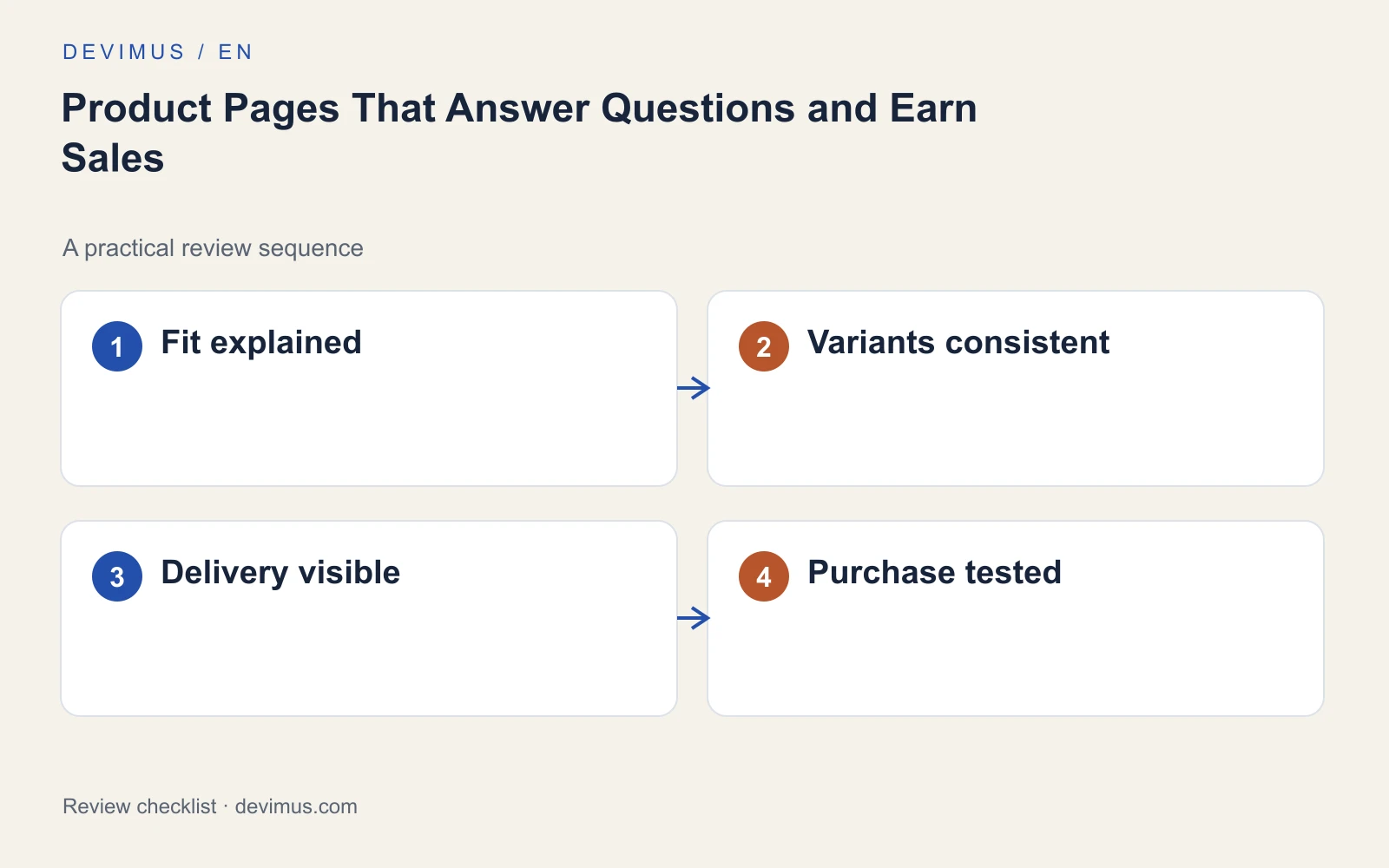
Delivery and returns information belongs on the product page, not only in the footer or the final checkout step. Shoppers want to know the total cost and timing before they commit. Check that each product page shows:
- The price for the selected variant, including any tax the buyer expects to see
- Stock status that reflects the chosen option
- An estimated delivery window and delivery charges, or where to check them
- Returns conditions in plain language, including who pays for return postage
- Payment options and whether an account is required
- A contact route for questions the page does not answer
How do you diagnose the purchase path?
Test variant selection, quantity, basket and checkout on a phone, as a new visitor with no saved details. Note every point where you have to stop and think, re-enter information or look for a cost.
Then compare product views, basket additions and completed orders alongside customer questions and returns. The pattern tells you where to look first:
| Pattern | Where to look first |
|---|---|
| Many views, few basket additions | Fit details, images, price clarity, variant selection |
| Many basket additions, few orders | Delivery costs, checkout steps, payment options |
| Healthy orders, high returns | Accuracy of descriptions, sizing and photos |
A high add-to-basket rate followed by abandonment points to later costs or friction; it does not automatically mean the product description needs rewriting. If you cannot see these steps clearly in your data, start with our analytics and reporting service or set up basic ecommerce events before changing the page.
An example to apply
Illustrative scenario, not a client case study.
A shop sells laptop bags. The product page lists exterior dimensions, and customers keep emailing to ask whether a specific laptop will fit. The fix is practical: add the usable compartment dimensions, explain how they were measured and name a few common laptop sizes that fit. That detail resolves the doubt more directly than another lifestyle photo or a vague claim that the bag is spacious. The shop then watches whether pre-sale emails and size-related returns for that bag change.
Discuss your project
Send Devimus a representative product page and the questions customers ask before buying. We will review it for buying uncertainty, variant handling and checkout friction, and tell you which fixes to make first.
Explore the relevant service · Request a free estimate