


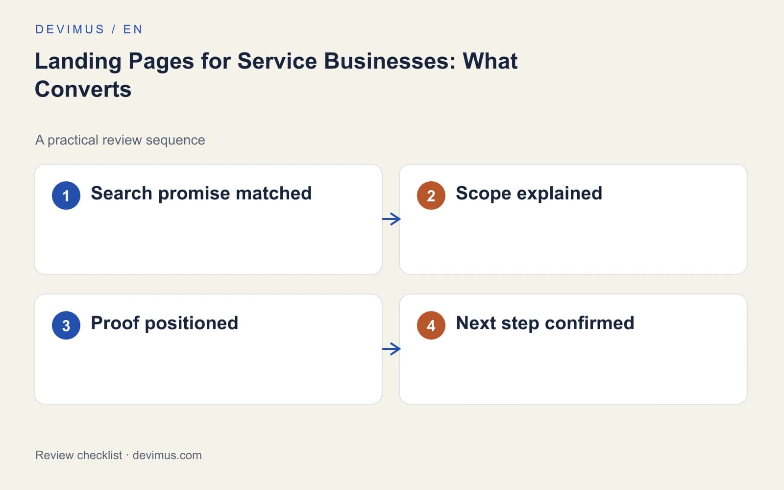
A landing page for a service business converts when it helps one specific person decide whether to enquire about one specific job. That means matching the search or advert that brought them, explaining scope and process plainly, placing relevant proof beside your claims and asking only for the details you need to reply well. Design matters, but it comes after the offer is clear. Start with the buying situation, then build every section around the questions that situation raises.

How is a landing page different from a service page?
A service page usually covers everything you offer within one service and has to work for organic search, existing customers and people comparing suppliers. A landing page has a narrower job: it receives visitors from a particular campaign, advert or search and helps them take one next step. Our guide to service page SEO covers the broader page; this article focuses on the targeted version.
Avoid sending every campaign to the homepage. Someone who clicked an advert for emergency boiler repair should not have to find that service in a menu. If the advert promises a specific service, the landing page headline should confirm it.
How do you match the page to the search or advert?
Define the service, audience and reason for the visit before choosing a layout. A page for an urgent repair needs clear availability and contact expectations. A page for a planned renovation consultation may need examples, scope and guidance on preparing for a survey. The main promise should stay recognisable from the advert all the way to the form.
Write the headline as a clear offer and use the opening lines to qualify it: the service, the area you cover and the problem it solves. Someone searching for office relocation needs different reassurance from someone moving a small flat. For Google Ads campaigns, Google assesses landing page experience on similar grounds: relevance, useful content and ease of use, which is the same standard a buyer applies.
Avoid urgency the team cannot honour and claims you cannot substantiate. A visitor who feels misled at the first step rarely completes the form.
Which sections should a service landing page include?
Give every section a role in the decision. Arrange the page around the questions that matter before contact: suitability, scope, process, evidence and next step.
| Section | Question it answers | What to include |
|---|---|---|
| Headline and intro | Is this the service I need? | Service, area covered, problem solved |
| Scope | What is included? | Inclusions, exclusions, what needs separate discussion |
| Process | What happens if I enquire? | Call, survey or proposal, and who does what |
| Pricing factors | What affects the cost? | Factors that change the quote, information needed |
| Proof | Can they deliver this? | Relevant projects with context, genuine reviews |
| Next step | How do I start? | Short form, phone option, realistic response times |
A process section can explain whether the customer gets an initial call, a site survey or a detailed proposal. This reduces uncertainty without pretending every project can be priced in advance.
What proof actually persuades buyers?
Place relevant proof beside the claim it supports. A project description should explain the challenge, the work performed and why it is representative of the service on offer. That is stronger evidence than a gallery of impressive but unrelated photographs, and a decorative logo strip does little without context or permission.
Use genuine, permissioned reviews that mention the type of work the page is about. If the page uses conceptual illustrations, keep them clearly distinct from photographs of real projects. Design should support understanding, not create the impression of experience the business does not have.
How much should the enquiry form ask?
Collect enough detail to route and qualify the enquiry: service, location, timing and contact method. For many services that is enough, plus a short description. A location or date field earns its place when it changes eligibility. Explain why sensitive or unusual information is needed, and do not demand a long specification before someone understands the offer.
After submission, confirm receipt, describe what happens next and only promise response times the team can genuinely keep. Offer an alternative route such as a phone number. Make error messages useful and keep what the visitor already typed. The person receiving the enquiry should see the same service context the visitor saw, and it pays to track forms, calls and qualified leads separately so you know which page produced real opportunities.
Does the page work on a phone?
Visitors from local searches and adverts often arrive on a phone, sometimes in the middle of another task. Test the page on a small screen, including real form errors. Check that the headline and main action are visible without scrolling past decoration, that buttons are easy to tap and that the page loads quickly on a mobile connection. Google’s Core Web Vitals give you a consistent way to measure loading, responsiveness and visual stability, and our guide to Core Web Vitals and INP explains where to start.
Then ask someone unfamiliar with the business to decide whether the service suits a specific project and request the next step. Watch where they hesitate without coaching them. If they cannot explain the offer afterwards, revise the promise and sequence before debating button colours.
An example to apply
Illustrative scenario, not a client case study.
For an office-relocation campaign, a useful page might ask for both addresses, the proposed move date and the approximate team size. It should explain how a site survey affects the final quote. A generic “contact us” form leaves those essential questions for a second conversation.
Discuss your project
Share one service and the campaign or search behind it. Devimus can scope a landing page around that single buying decision, including the form, tracking and mobile testing.
Explore the relevant service · Request a free estimate